

For handmade sellers, sometimes just getting your online store up and running is the greatest challenge of all. Early on, many sellers embrace the entrepreneurial thinking of having a minimum viable product (MVP), or a version that’s good enough to sell, but that may require some changes to support quality, marketability, or general appeal over time.
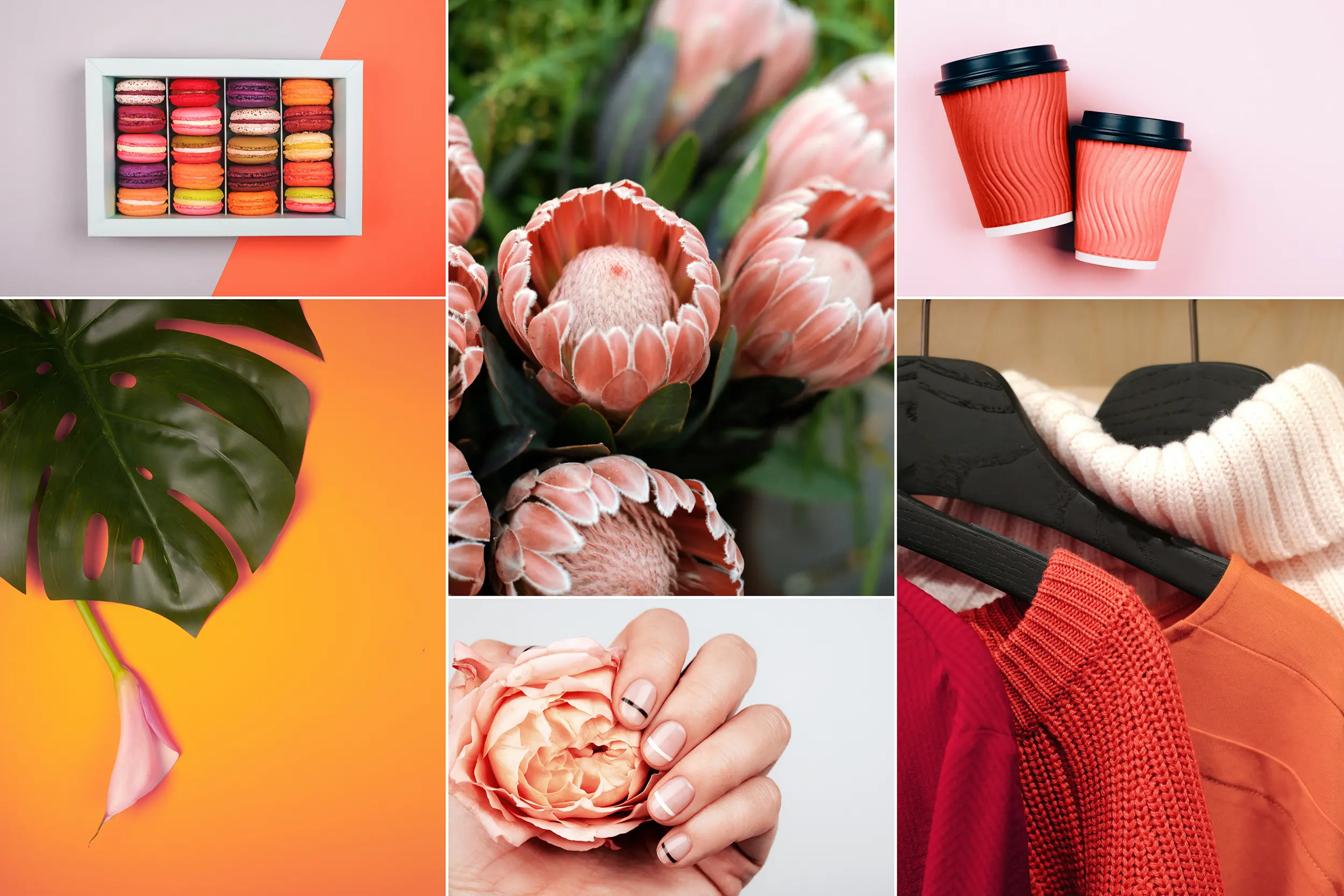
Regardless of how well refined your product is, in your online store or even retail space – if you have one – your product needs to be displayed in a way that supports sales and invites curiosity. Through the years, visual merchandisers have embraced color psychology to help them make decisions about how to best present products in virtual and physical environments. These decisions can entice action, build brand loyalty and even improve sales.
“Color psychology studies how colors influence mood and decision-making, and it’s important to remember that there’s no one-size-fits-all approach for how to use colors.”

Here are some color psychology tips to support your visual merchandising strategy.
Tip #1: The Power of Red and How to Use It

A popular sentiment when it comes to color psychology is that red entices action. Generally, that’s true, but think of all those great products that have red nowhere near their brand, and still thrive. Apple, for example, is a technology brand largely steeped in grays, whites, and simple black fonts. Boring? No, Apple uses those modest colors to emphasize sleek, approachable products – and it works!
On the other hand, red works great for Target department stores. Red brings life to the logo, but you’ll also notice that with its website presence, web designers at Target use red sparingly. Sections and pages commit to the colors needed for product types, holiday themes, and whatever is needed to drive specific messaging. So, let’s boil down what we know about red, and attribute the findings to the handmade seller’s website, and his or her visual merchandising strategy.
Red is effective in getting attention for a sale or special promotion. Just like in a retail store, those small flashy red signs direct you to the highlighted products. Small amounts of red in text, or on buttons and tabs, can steer website visitors to new, clearance, or hot sale items.
At the same time, don’t go out of your way to use red in product development or in a display. Use it to catch attention and guide at first, then you may find obvious uses, such as Valentine’s Day and holiday themes. Beyond that, however, keep red to a minimum. If it’s a red accent pillow on a black or grey couch, that’s a great visual pop that captures attention, but don’t lean too heavily on using red as the only way your products and brand can stand out.
Tip #2: Consider the Emotions Your Products or Brand Conveys
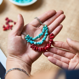
Many handmade sellers offer jewelry, bracelets, necklaces, t-shirts and other clothing. These products, by nature, trigger emotions and sentiments. It could be an outrageous statement on a shirt, or the cool turquoise calm on a ring that spurs sentiment and meaning for a buyer. All of these potential emotional triggers speak to how you use colors in branding and product displays.
If you’re brand is about cool vibes and serenity, consider blues and greens in your visual product displays. For example, if you sell woven bracelets or necklace products in earth tones, a blue or green backdrop could be an excellent stage for the products. These colors are close together on the color wheel and exude dependability and quiet strength. Depending on how dark or light your product is can inform you how bold or light your green or blue can be. A black stone against a light blue or green can stand out beautifully, or a tan product might need a darker blue or green to help it stand out.
Yellow is another emotional color, and it can stimulate considerable joy, (hello McDonald’s!) but it should be used very sparingly, and probably not as an entire background as large sections of yellow will also create anxiety.
Pink can also evoke a sense of optimism, but you’ll need to experiment with it depending on whether it’s a product prop, background color, or your brand. Pink has more versatility than people give it credit for. It aligns with feminine fun and sensuality in Victoria’s Secret, but it’s also lively and hopeful for T-Mobile. Both of these brands will mix in white, black, and gray for their product displays as well – which brings me to the next tip.
Tip #3: Don’t Forget White, Grey and Black
If you look at how products are displayed online, you see your share of white backgrounds. White is the color of consistency and simplicity, and it’s pretty much a no-brainer for displaying products.
Grays can work as well, but if your product has a lot of white in it, you may need to consider a black or gray background for contrast. Again, Apple embraces these three simple colors amazingly well in both product displays and to show off slick stylings. And if you are going for a modern feel, then don’t rule out the power of white, gray and black.
Tip #4: Think About Focal Points and Mixing Things Up
When it comes to color psychology, rules are made to be broken. In the world of visual merchandising, pops of color are what help items stand out and focus your customers’ attention where you need it. But to get that to happen, there is also plenty of room for experimentation.
So, let’s say you have some cylinder display pieces for bracelets or watches. If the products are white or black, then sharp pink, yellow, orange, or even a deep purple can work well to contrast the product against the display pieces. This focuses the customer’s attention on specific colors and often gets them zooming in for close-ups.
If you have store displays, you can also show off multiple items or product groups. If, for example, you have five different colors of tank tops or hats, use pedestals and mannequin pieces to display them all in one photo. Have customers click on the photo and navigate to a landing page where they can browse specific color types. At the same time, avoid crowding and having too many colors or products in one shot.
Tip #5: Get Input & Trust Your Gut
It’s important to also remember that color selection in merchandising has nothing to do with your favorite color. You are making decisions that best serve your customer experience and keep people wanting to engage with your products and brand.
So, if you’re not sure about how something looks, test it. Just like A/B testing in online marketing, you can try one display or product view one week, and a different product view or display the next week to see which performs better. You can also solicit the opinions of customers and others involved in your business. Often, knowing something doesn’t work is a critical first step towards a solution.
Again, there’s no one-size-fits-all approach. Data and input will help you separate the winning display choices from the others. Mix in a fresh, fun perspective that allows you to experiment and break the rules, and you may find you even enjoy making some mistakes as you learn the best ways to display your handmade products.

Ray Ko is the Senior Ecommerce Manager at ShopPOPDisplays. With years of experience in the retail space, Ray is an expert in formulating and implementing e-commerce strategies to increase revenue.


