Packaging- glorious packaging! We have been on a quest to talk find creative artisan soap packaging. This is the first of a number of soap packaging articles that are are publishing. Our goal is a practical one- to give you all kinds of ideas to get the creative juices flowing!
Book mark it, savor it, and relish in all the amazing packaging and the incredible artisans making these products. All artisans have provided their answers to our questions about their product packaging. Dig in and see how their experiences can help you decide what to do for your next soap packaging. In many cases, you will even find the names of the companies that they worked with to create their packaging.
This is by far the most comprehensive research we have collected from artisans around the world to understand what influences their packaging designs and decisions.
We are proud to have soap makers from around the world included in this article- Click on the individual images to jump to their specific stories.
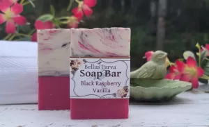
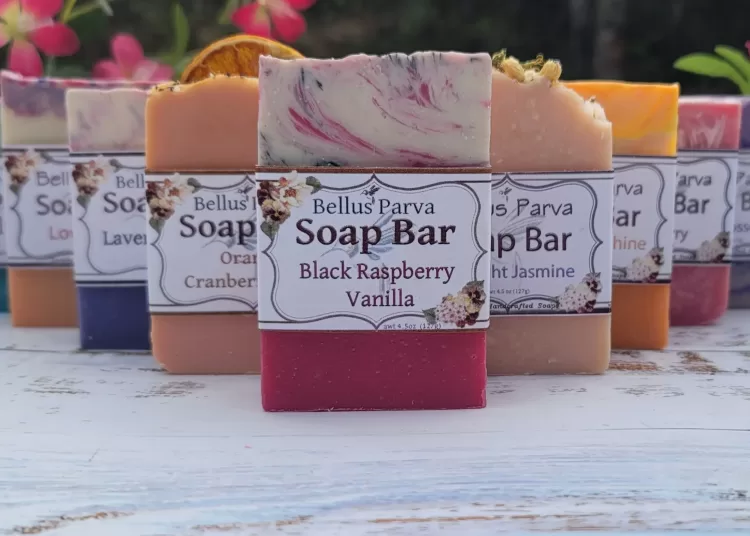
Bellus Parva- Oregon, USA
When we saw Angela’s soaps, we had to learn more about her packaging. Right away we noticed her distinctive style of packaging on her soap bars. Here is what she shared with us:
How did you decide on the soap packaging that you are using?
I first started making soap over 13 years ago. I started with the basic soap mold style, not long after I came across a tall and skinny soap mold. When I tried it out I discovered I was able to play around with soap designs that had more layers in them. I was in love! My husband made me some larger, tall and skinny molds. Those are what I mainly used over the next few years while I was finding that perfect soap recipe. When I decided I wanted to try and sell my soaps, I realized not many soapers in my area were using this design. I figured this might help me stand out a little from the rest, kind of being a little unique for the area. My first experience as a vendor at an event went really well. Everyone commented on how much they liked the design. As soon as I got back my husband made me several more soap molds and it’s been that way ever since.
How did you create your labels for your soap?
Of course using a tall and skinny soap style meant I had to design my own labels. I learned how to use photoshop and created my own design. Then I print the labels out on basic card stock or on label sticker paper that I get online. Printing them myself works well for me. One, I’m a small business with a small budget and two, less waste for me. I can print as many as I need at the time and if I have to make a small change for some reason I don’t have to toss out a bunch.
What advice would you share with new soap artisans?
Package and labels should be in line with your brand. This did not come easy for me. Someone told me once, to think of it as a reflection of your company’s personality. Once you figure out you company’s style or personality then you want to keep it cohesive among all your product labels. I can’t tell you how many times my customers found me at an event or in a store because they remembered my label design. For soap makers, one other very important thing to remember when making soap labels is to check what the government requires you to have on your labels. It sounds like a lot at first but once you get it, its kind of fun creating new labels.
The Weyward Sisters Soap and Candle Company- Maryland, USA
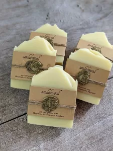
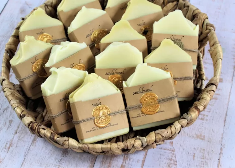
This label and packaging caught our eye- with the distinctive look of days gone by. Our focus was on this distinctive design, and here is what Bethany and Rachel shared with us about that design:
This label looks historical in nature- can you tell us more about this product?
“Occasionally we will make a soap that we want to use a different label for. One soap line in particular that uses different labels is our colonial soap line.
Originally made for a colonial festival we were attending, we started making these soaps year-round when they began to sell online to museum gift shops and historical bed-and-breakfasts. The recipe and scents for these are inspired by the types of soaps that were available in colonial America, so, unlike most of our inventory, they are plain white bars.
While the kraft color of the paper band fit the aesthetic we were going for, we decided to simplify our logo into something more period-appropriate. We changed our font into a historical-looking typeface and pared down the wording as much as possible. Once the bars were wrapped in these new colonial-looking paper labels, we wrapped each bar with a length of jute twine around the label and secured it with a gold wax seal. The resulting look is charming and draws the eye to what would otherwise be a plain white bar of soap.”
Can you tell us more about your approach to packaging for soap?
“At The Weyward Sisters, we not only focus on making our soap beautifully scented and nourishing for the skin, but also with colors and designs that our customers have never seen before in bar soaps. Since we put so much effort into making our bars beautiful, it’s no surprise that we don’t want to cover up all that hard work with packaging.
Each soap bar is individually wrapped with a 2” wide soap band. We use a high-quality kraft cardstock that we print in-house with single-color black printing. The brown color of the cardstock is a versatile neutral that fits the aesthetic of our brand and the black printing gives a clean and uniform look to our products while remaining cost effective.
Since fragrance names and ingredients vary from bar to bar, we like being able to change the information on the labels without too much fuss: we simply edit the text and print the amount of labels needed. Cardstock can jam up some printers, so we have a high-quality laser printer in our workshop specifically rated to print on thicker materials.”
Whispering Willow- North Carolina, USA
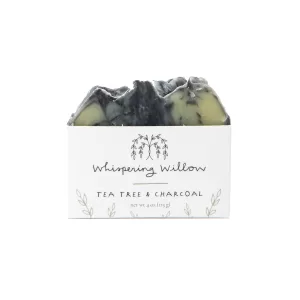
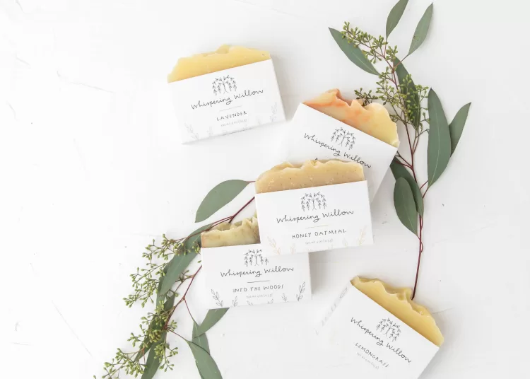
We saw Julia’s elegant and simple box design, and wanted to understand more about this packaging. Julia share with us the following:
Can you tell us more of the back story for your soap products and their design?
My name is Julia. I’m the founder of Whispering Willow, a company that encourages indulgent self-care and mindful giving through handcrafted apothecary products. Our small team in North Carolina handcrafts giftable products that are certified cruelty free, made with organic oils and essential oils, and are built for relaxation.
About Whispering Willow
– Products are handcrafted by a small team in North Carolina
– We are members of 1% for the Planet
– Certified Cruelty-Free through Leaping Bunny
– WBENC-Certified Women’s Business Enterprise
– We choose organic oils and essential oils
How did you decide on the soap packaging that you are using? How did this fit with the overall aesthetic of your product?
When choosing packaging for our bar soap, we knew we wanted to emphasize the wave-like appearance of the top. With that in mind, we had the folks at Shoppe Theory help custom design holster top soap boxes for us. We partner with Yebo who then created the custom boxes for us.
Pine Creek Soapworks- Michigan, USA

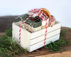
I looked at the holiday trio Alicia Pickles created and was captivated. Rich with detail, I wanted to know how she approached creating this trio. Here is what she shared:
How did you come up with this particular design?
“I have always found the natural decorations of years gone by to be nostalgic and charming. Garlands of cranberries with popcorn,dried fruits, and elements such as evergreens just make me happy!.This past Christmas, I knew I wanted to somehow incorporate this style into decorating seasonal soaps and showcasing them in a special way. The idea further developed into offering a trio of holiday soaps, all packaged and ready for gift giving!”
Can you tell us how you made these soaps, as they seem very unique.
“Woodlands soap got its rich, deep green color from chlorella, french green clay, and a small amount of activated charcoal to deepen the tone. The top was accentuated with a tiny pine cone, and red peppercorns Sweet Peppermint soap boasted lovely white swirls in an ivory base colored with white kaolin clay, with a sprinkle of rock salt on top. Rounding out the soap trio was my personal favorite, Cranberry Orange. To make this soap, I pulled out my old, trusty dehydrator! A local grocery store happened to have oranges with a striking, deep colored flesh, called Cara Cara oranges. These beauties maintained a rich color even after being dehydrated, so these slices became the centerpiece of the Cranberry Orange soap. With the slightest sprinkling of cranberry seeds atop the turmeric and rose kaolin clay colored base, the effect was complete!”
How did you create the packaging to complete the trio?
“To showcase the trio, I found small 3″x5” wood slat crates that had the natural look I wanted. The 3 soaps fit in there very well, and allowed a little space on each end to add some rustic wood excelsior filling. A bow tied with red and cream twisted yarn offered the perfect finishing touch!
These holiday soap trios ended up being great sellers for me! I sold quite a few through my website, but they really flourished in stores that carried Pine Creek Soapworks products, since these were wonderful, ready packaged gifts for family and friends. Several stockists liked them so much that they requested a spring edition!”
What did you include for the Spring Edition?
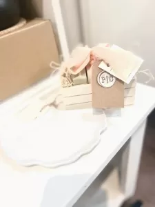
“For a spring edition I kept things a little more simple. I included 3 soaps in pastels- Aloe & Clover, Honeysuckle Raspberry and Lavender. This time I used a peach chiffon ribbon and used a tag with a wax embellishment! I’ve included a picture that a local store posted if the box.”
Kaya Soaps- Indiana, USA
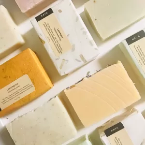
Simple and eco-friendly packaging is a great way to approach packaging. We loved the delicate colors of this design, along with the minimalistic look of the labels. We asked Priya for more details on how they approach packaging. Here is what she shared:
How did you decide on your product packaging?
Our products are made using natural and organic plant based ingredients and essential oils. So we wanted the packaging to suit the products. Our goal was to be a zero waste company to support the green environment. This is a reason we chose the packaging eco friendly, recyclable and sustainable.
We chose handmade paper to wrap our soaps, our tiny contribution to help sustain handmade paper industry. This handmade paper is traditionally made using bamboo leaves, flowers and leaves of other trees. The different colored papers help identify the different soaps and also give a unique look with a handmade touch to this gift set.
We print our labels as per need in our studio. All labels are recyclable.
What advice would you give a new soap artisan as they consider their packaging?
To the new soap artisans I will suggest to first think about the theme of their products and start small. It is not advisable purchase the packaging in large quantities initially. The labels can be printed as required in your studio to reduce cost. Think about using sustainable and recyclable packaging where possible. We all need to help keep the green environment.
Soaps and Beyond- West Virginia, USA
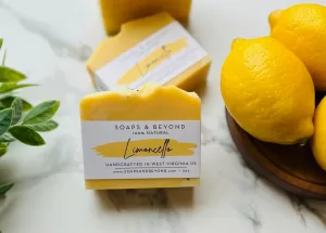
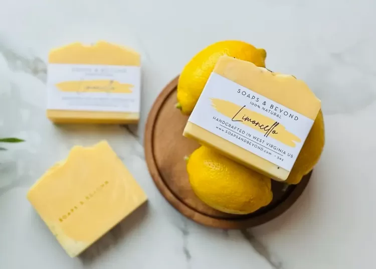
Something about Anel Drapalik’s Limoncello soap just makes me picture spring. The simple packaging, the splash of color- I can almost smell this soap from my computer. I asked Anel to share more of the story of this product:
Tell me the story of the creation of the Limoncello soap.
“I was looking for a natural uplifting soap that is not just going to clean the skin, but is going to set the mood for the day. Limoncello soap has such an invigorating, uplifting scent that starts your day on the right foot. The essential oil blend used in limoncello also helps you focus, and citrus essential oils are well known to repel insects.
When I create a new soap, it needs to have more than one skin/aromatherapy benefits. I write down the essential oil blend I want and then I’ll continue by adding more skin loving ingredients to pair well. In this case it is with the oils blend. Limoncello soap is 100% natural colored with annatto seeds, which are rich in antioxidants that help protect the skin from damage caused by free radicals.
Limoncello soap was formulated to be a spring seasonal soap, however this soap has become a staple in our all year round inventory due to high demand.
Can you share why you use the packaging that you are using? Do you buy it and print on it, or is it custom made?
Our packaging is very minimalistic. I try to keep our packaging as simple as possible to maintain our focus on the high quality ingredients that will nurture your skin vs. investing more on packaging that will be disposed of. You can still have a beautiful but yet simple end product.
I acquired a basic soap label template, and customized it with the needed and required information. All of our product labels are printed in house with soy-based ink as it is more environmentally friendly.
Can you tell more about how you have been doing local sourcing for some of your ingredients? I love hearing this and am a big believer in this as well. I’d love to hear more about your journey to sourcing with more sustainable products.
We have several local apiaries and farms around us that we like to get honey, beeswax and goat milk from. There is a field full of Lavender that you can handpick the flowers, if you haven’t done so, it’s a must!
We also have other plants that grow wild in the area such as: Jewelweed, Comfrey, and Stinging Nettle that we infuse and use for our healing salves.
Before buying from a company, I do my diligent research to make sure that the ingredients are truly sustainable by reading the fine print. Another thing I do is ask for further information, and sometimes ask for documentation to prove such as a certification.
Soap Daze- Devon, United Kingdom
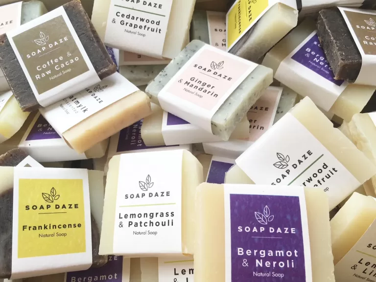
Frankincense? How amazing! When I saw this unique take on a holiday soap, I had to know more. Sharon Mitchell shared these details with me:
Can you share how you are making your labels and how you chose your packaging?
“The photo enclosed is of my guest soaps. I print these in house, with a laser printer and hammered paper for a bit of texture.
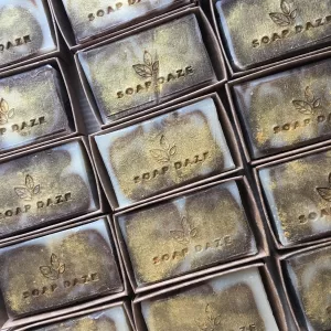
All my soaps are stamped with my logo, this is done when soaps are first cut and they’re still fairly soft. This was an important part of branding, so that if anyone photographed them it would be clear that they’re mine!
The frankincense soap is brushed with gold mica.
I started Soap Daze in 2011, when they weren’t very many soap makers, and lots of people thought that soap was yuk and unhygienic!
My packaging for the next five years was terrible as I did it myself and was clueless. I dreaded developing new products because I had no idea how to label and package them. The soaps were totally enclosed in packaging so you couldn’t see them. I felt I was letting my products down.
In 2016 I worked with a designer to finally give Soap Daze a proper brand look. When he saw the soap unpackaged he said ‘Wow’. He could see the love and craft that gets put into a handmade product.
He created everything I asked for – minimalist, clean, with branded kraft card matchbox style soap boxes, so you can slide open to see the soap.
There are 3 different ranges of soap, each with 6 different scents. My favorite is the Harmony range, the soap names are from bands and songs that I love, and the label designs are inspired by Peter Saville’s color chart for the Hacienda.
As soon as Soap Daze was given a brand makeover, customers were more engaged, the soaps were noticed a lot more and sales increased significantly.”
What advice would you share for new soap makers?
“My advice for new soap makers would be to develop a brand look that you personally love, not what you think customers would like. A small handmade business is very personal, and if you spend your days looking at something that doesn’t mean something to you, it’ll be hard to go forward!
Try to do printing yourself, start small, create packaging that reflects your brand values. Don’t be afraid to ask for help and have fun!”
One blessed acre farm, California, USA
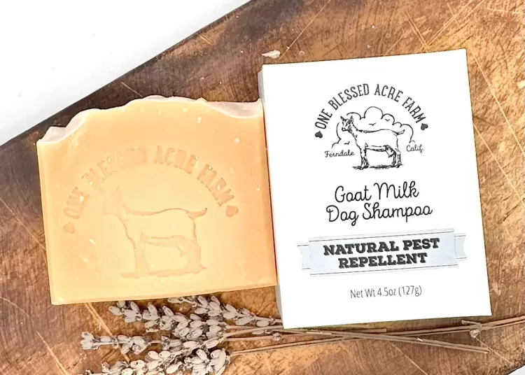
When I came across Michelle’s soaps, I found interesting product line extensions. While she makes traditional soaps, she also has a shave soap as well as Dog Shampoo. Check out what she shared with us:
Can you tell us more about your drawstring packaging?
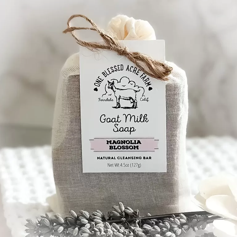
“All our bar soaps come enclosed in a muslin drawstring pouch. Custom labels are crafted at a nearby print shop, reflecting our commitment to local businesses. This choice of packaging serves multiple purposes: First, it aligns with our zero-waste ethos, being entirely compostable and contributing valuable material to compost piles. Second, the charming simplicity of the muslin bag, adorned with a plain white tag and bound with jute twine, perfectly complements the rustic farmhouse aesthetic that defines our brand identity.”
How are you creating the stamping on your soaps?
“Apart from our external packaging, we also personalize each soap with a uniquely designed stamp featuring our logo. We procure these stamps from a seller on Etsy. This strategy effectively distinguishes our soaps from those of other producers.”
Can you tell us more about your shaving soap? How did you create this product?
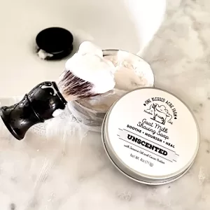
“Goat milk shave soap is a type of shaving soap that contains goat milk as one of its primary ingredients. Our soap is specifically formulated for shaving purposes and includes a blend of sesame oil, cocoa butter and other natural ingredients along with goat milk. When used for shaving, goat milk shave soap creates a creamy lather that helps lubricate the skin, allowing for a smoother and closer shave while also nourishing and hydrating the skin. Additionally, the presence of goat milk can provide soothing and calming benefits, making it particularly beneficial for individuals with sensitive or easily irritated skin. Overall, goat milk shave soap offers a luxurious and effective shaving experience with added skincare benefits.
We selected our packaging to cater to the diverse needs of wet shavers. Men typically prefer shave pucks stored in a shaving bowl, while women require a convenient solution for shower storage. For gentlemen, the soap is easily removable from the tin. Meanwhile, the tin offers women a space that can fully dry out between uses, maintaining optimal conditions for storage in humid shower environments. The tin’s sleek design attracts both male and female customers, complementing our existing branding with its simple and clean labeling.”
Tell us about your dog shampoo line. How did you design the packaging to fit with your overall branding, yet still be distinctive?
“Our dog shampoo bar was inspired by our beloved Great Pyrenees, Kevin, who often got covered in dirt and grime from our farm. To address this, I began with our base bar soap recipe and incorporated four essential oils known to combat fleas: orange, cedarwood, lavender, and peppermint. Just like its healing properties for human skin, goat milk works wonders for dogs too. Dogs suffering from dry, itchy skin experience relief after just one wash with our goat milk dog shampoo.
For packaging, we opted for a box to distinguish it from our “human soap” line. The design features clean, simple lines on a white compostable box, with a touch of whimsy through a catchy saying: “Anybody who doesn’t know what soap tastes like has never washed a dog.” These custom boxes are crafted for us by Your Box Solutions. ”
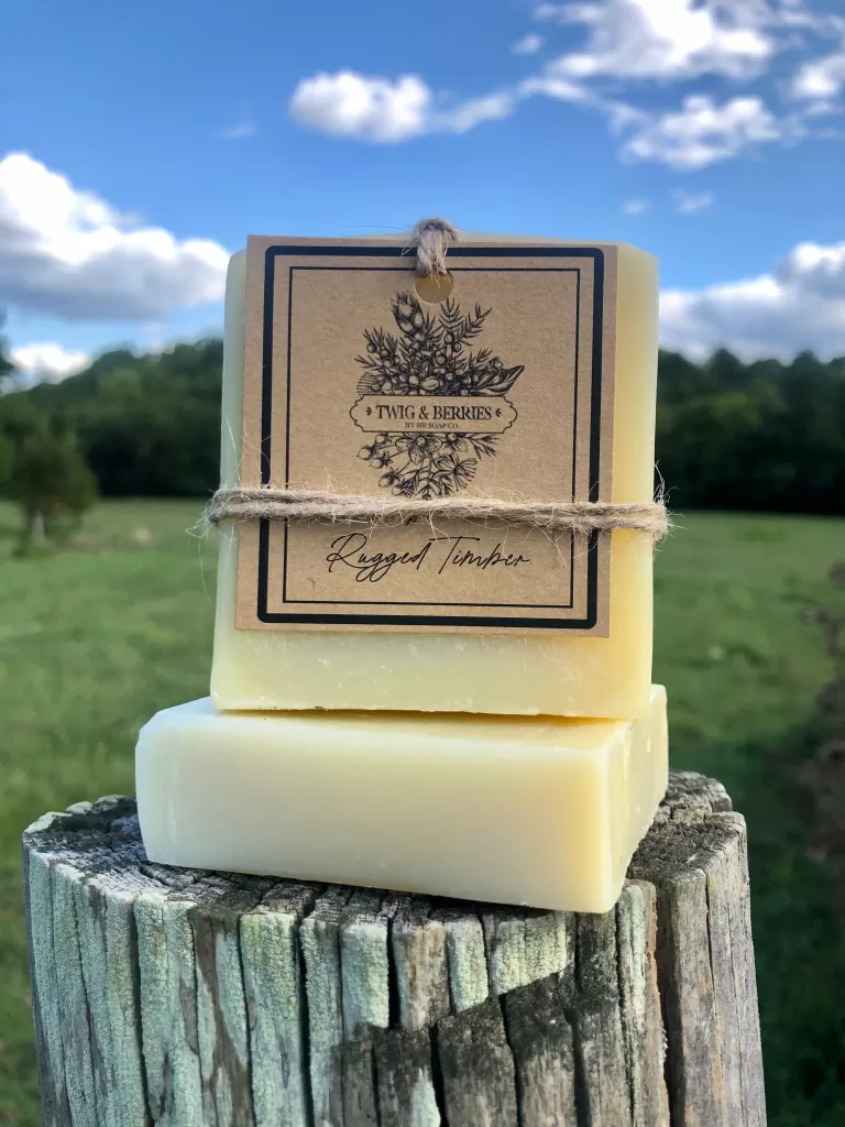
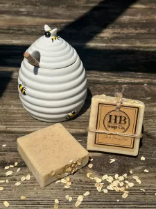
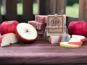
As I looked at HB Soap Co I was intrigued and curious about how they have built out both HB Soap Co and Twigs & Berries to co-exist as part of the same company. Here is what Myrna Bacurin shared with me:
Tell us about how you initially set up your packaging for HB Soap Co?
I started HB Soap Co. a few years ago. I was purchasing hand made soap from a friend who stopped selling and producing it. I loved her soap and the fact it was all natural, and since I didn’t know where else to get it from, I thought, “I can make this!”. After a lot of research, I started out on my soap making journey.
I love being in the kitchen. I found that making soap was a way for me to express my creativity while providing my family and friends with soap that is nourishing, cleansing, and all-natural. I decided pretty quickly that I enjoyed making it (and others enjoyed using it) so much that I turned it into a small business.
Rooted in Huntington Beach, CA, I envisioned a brand that was based on the use of natural ingredients and also upheld the principals of environmental responsibility. Living close to the ocean made me aware of the importance of minimizing our environmental impact and I wanted to make sure my products lived up to my standards.
I live outside Nashville, TN now, but I continue to stay true to my roots and further my vision of all-natural and sustainable products by locally sourcing products when they are available. I get my goat milk from a farm up the road and my honey from a local beekeeper. I believe this not only creates a higher quality product, but helps to support my community and reduce my carbon footprint.
From the beginning, I envisioned the packaging as an extension of my all-natural vision. Designing the logo was the first step in the process. I wanted a logo that captured the simplicity and the natural allure that embodies the brand and the laid-back lifestyle of Huntington Beach. Naturally, the palm leaf fit that vision perfectly. With the help of my talented husband, we worked together in Adobe Illustrator to design the perfect logo for HB Soap Co.. For the font, I relied on the professionals and purchased a font package that I believed extended the natural/beach-inspired vibe.
After the logo was created, I moved on to the actual product packaging. I researched boxes and labels and everything in between and nothing felt right. I decided I would have to create my own packaging to fit my vision and not rely on anything pre-made. The elements of the packaging were carefully chosen to minimize environmental impact, while maintaining a touch of rustic charm. Crafted from recyclable materials, like kraft paper and finished with natural jute string, I wanted the packaging to evoke a sense of simplicity and connection to nature.
Once the packaging design was decided upon, I turned back to Illustrator to design the labeling templates. I print the Illustrator templates I created onto 8.5 x 11 sheets of Kraft paper. To streamline the process, I purchased a heavy-duty paper cutter which swiftly transforms the sheets into individual labels with crisp edges. After the labels are cut, I hand punch holes in the front and back sides of the individual labels in preparation of finishing the labeling by tying them off with jute string.
The labeling for my soap is a labor of love. It is time consuming, it is a lot of work and I could use pre-made labels or boxes to save a lot of time and energy, but…I get so many compliments on it and I am so happy with the way it turned out, it makes it worth it.
Tell us how you went about creating a product extension line for HB Soap Co?
Twig & Berries is a product extension of HB Soap Co. I set out to make a soap line for men that embodies the essence of masculinity while staying true to the brand’s commitment to all-natural products with environmental responsibility. I came up with the name “Twig and Berries” for my men’s line as it carries a twofold significance that represents my commitment to nature-based products and a cheeky nod to the double entendre. The name Twig and Berries pays homage to the natural world evoking images of raw, natural beauty found in forests and woods, as well as the nourishment of the fruits that come from the earth. On the other hand, the name carries a lighthearted playfulness, offering a wink and a nod to its colloquial reference to the male anatomy. It always makes me smile and chuckle when people get it.
The image of the twigs and berries in the logo was purchased. That is far beyond my design capabilities. I used the Illustrator template for HB Soap Co. to create the template for Twig & Berries. I modified the design of the twigs and berries image and created the logo for the product line. The packing process is the same as the HB Soap Co. line. I have a few different product extension lines off of HB Soap Co. and I keep my packaging consistent across the various extensions. I think it’s important for customers to be able to see the brand extension and recognize that it is a part of the HB Soap Co family.
As a final note to packaging, when I am at craft fairs and markets, I use kraft bags to send my products home with my customers. I purchased a large stamp of my logo and I stamp the kraft bags with the HB Soap Co. logo. I put a business card inside the bag and complete the take home packaging by adding some tissue paper on on top. I think it’s important to be consistent with your packaging from design through delivery.
What advice would you give new soap makers on packaging?
To people that are considering the design of their soap packaging, I would encourage them to first determine their target audience and what their needs and preferences entail. Whether they are individuals seeking luxurious ingredients or eco-conscious consumers looking for sustainable alternatives, you’ll want your packaging to reflect the important considerations of the audience you’re targeting. Once this is determined, you can create a brand that resonates with your audience and packaging that communicates the heart of your brand. Through this you can create a brand that fosters connection and loyalty.
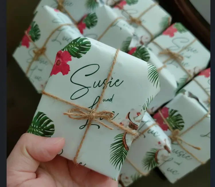
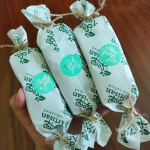
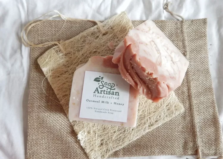
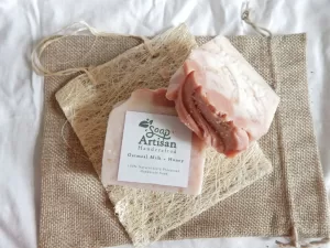
I was hunting around on Instagram when I came across packaging that reminded me of candies from when I was a child. On a whim, I reached out to Soap artisan PH to learn more. It turns out a team of 3 is behind this company- Joyce Sze Wang, Derrick Wang, and Clyde Sze. Here is what Joyce shared with us:
Can you tell us more about how you are making your soaps in the Philippines?
“We would like to introduce Soap Artisan PH. We are offering organic handmade soap made with natural, pure and premium ingredients. Mindfully crafted in small batches, hand poured and hand cut.
We started this shop in remembrance of both our moms who have passed away in 2021- my husband’s mom due to cancer and me and my brother’s nom due to covid. They both love handmade and natural things. Soap is definitely something they would definitely love and would really be happy that we finally have the courage to start something that we all love doing.
Our soaps are made with coconut oil, olive oil, castor oil, and other oils that are beneficial to the skin, we also put in additives that are natural and organic such as oats, clays, coffee grounds, milk, and honey products that gives good benefits to the skin
Our soaps are mildy scented, suitable for all skin types, they are safe for kids, pregnant women and lactating moms. It can both cleanse and moisturize your skin and can be used for both face and body.”
How did you design the packaging for the wedding favors?
“For us how you present your products to clients would say a lot about your brand and for us we think that the simpler the better, less waste and more eco friendly and definitely more natural. We think that the most important thing is the quality of the product itself and the packaging we do is done with love because we want our clients to feel the love we have towards our products and we hope they would also appreciate the work that goes with our soap bars.
For the Luc and Susie Wedding Giveaway, We used their invitation design elements and made our wrapper for their soap have the same design so that it would look really nice for their guests. This was our first ever bulk order and we are very very happy that it was a success!”
Can you tell us about the creation of the sampler set?
“For our sampler set, it is now by request! We packaged it like candy because our natural handmade soap looks really yummy as some of our clients tell us it looks a lot like dessert thus we came up with this packaging since it is the most creative idea for it.
Recently we made our sampler half bars because we think that our sampler set is too small and our clients might not fully feel the soap if its too small so we came up with half bars and we hope that more people would shift to trying Natural Handmade Soap.”
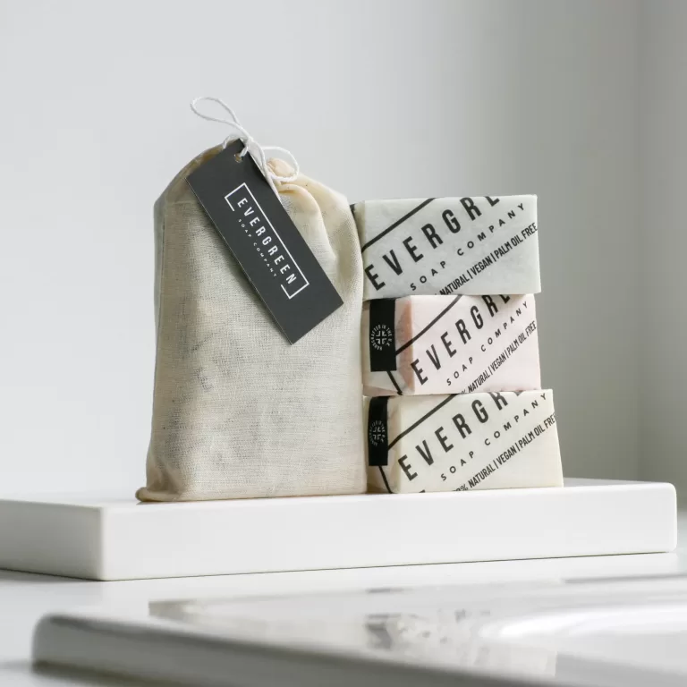
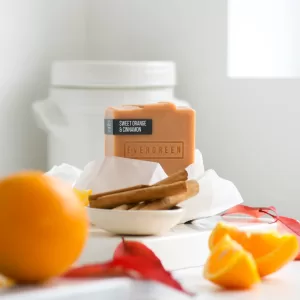
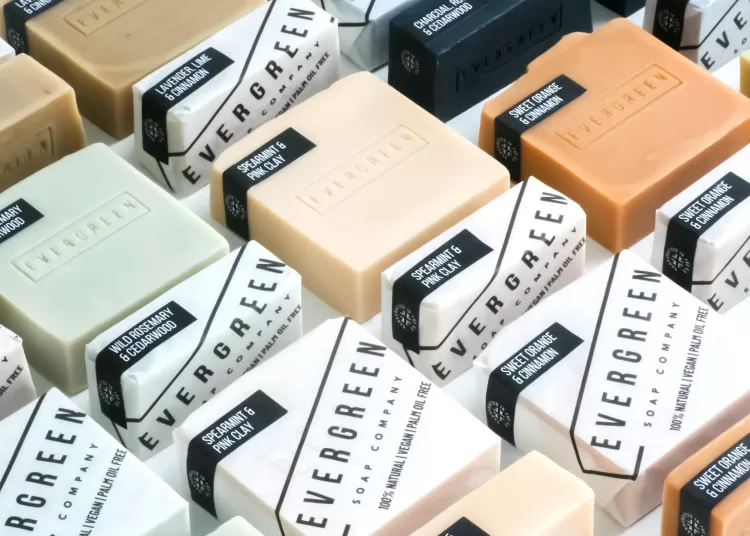
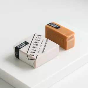
I admired the clean lines of the packaging design from Evergreen Soap Company. As I researched, I learned a lot about their eco-friendly packaging. Here is what Alastair share with me.
Here at Evergreen Soap Company, all of our packaging materials have been carefully chosen with the planet firmly at the front of our minds.
Everything that we use is compostable, sustainable and biodegradable. Our soap wraps are made with 100% natural grease proof, FSC certified paper, and printed with non-toxic UV ink. During the pulping process the paper gains its natural greaseproof properties.
We have our wraps custom printed to ensure quality and consistency. This means ordering large quantities of wraps at one time, so making sure we were 100% happy with all design elements before going to print was vital. This took a lengthy design and testing process.
Finding the right paper was also something that took a long time and a lot of research. There are so many options out there and we wanted to find something that felt premium, modern and natural whilst also being sustainable and aesthetically appealing.
The paper that we eventually found has a slightly transparent quality, allowing the colour of each bar to come through in a subtle, but noticeable way – this was really important for us. The touch of the paper when handled was also very important when making this choice – it had to be tactile and satisfying with a lovely crisp, crunchy sound.
Our packaging design reflects Evergreen’s brand values and clearly communicates our key messages to customers. Our logo is over-sized to catch attention and leave a strong impression, with our 3 USP’s printed in bold underneath – 100% natural, vegan, palm-oil-free.
We then add a small black tab to each bar, showing scent and indicating that the bars are handmade in the U.K. We have these black tabs custom printed by a second company – again on sustainable FSC certified paper with eco-friendly ink.
The back label offers further key information including ingredients, usage instructions, scent notes and indicating that all soaps are enriched with organic shea butter. These labels are sourced by a third company and are printed on recycled paper.
All soap variants are wrapped in the same paper. This gives us a clean, modern, minimalist and consistent aesthetic across all our brand. The only thing that changes is the black tab, indicating scent.
We stick to a black and white pallet across all packaging with the actually soap being the only colours ever seen. This mono-chrome design is purposefully gender-neutral. Bar soap is increasingly popular with the male market, so we wanted to ensure that our packing and over-all branding was appealing to as wide a demographic as possible, whilst not cutting off our core female customer base.
Our font choices are clean, modern and consistent across all imaging and packaging, appealing to a younger market than many traditional soap brands. Font is so important and tells a story in itself.
Overall we wanted our packaging to stand out in an over-saturated market – something that we hope we’ve achieved. All packaging was designed in-house.
Tell me more about the story behind the 3 soaps in a gift bag. Is there a back story on how you decided to do this? How have you found it has been received by customers?
We created the 3 bar gift bag last year as a cost-effecting gifting option for all occasions. The neutral cotton drawstring bag fits with our brand aesthetic and we add a black premium tag to create a luxury but affordable set. Customer can choose any 3 small bars, giving customization options.
This has been our best selling gift over the last 12 months. During the festive season, we also offer a larger gift box, however we have found that the lower prices gift bag is at a price point that is most appealing – perfect as a secret-Santa, house gift or stocking filler.
We will also be releasing limited edition gift bags for mothers day and fathers day with customized tags.
Any tips you would share for a new soap maker that is thinking about their packaging?
Find your target market and create something that appeals to them. Don’t copy everyone else – do your own thing and keep it consistent. Let the soap be the star and the packaging enhance the product.
Do you sell all of them wrapped in packaging or do you sell any unwrapped bars?
We offer all soaps unwrapped to our wholesale customers. This option is particularly appealing for more eco / refill style outlets. For these retailers we loose the paper wrap altogether, and stick the black scent tag and back label directly to the soap. All bars are stamped directly with our logo, so there is consistency with the brand, even without the wrap.
This form of packaging allows use to keep a strong aesthetic, whilst also offering as minimal packaging as possible and adhere to all legal requirements for selling cosmetics.
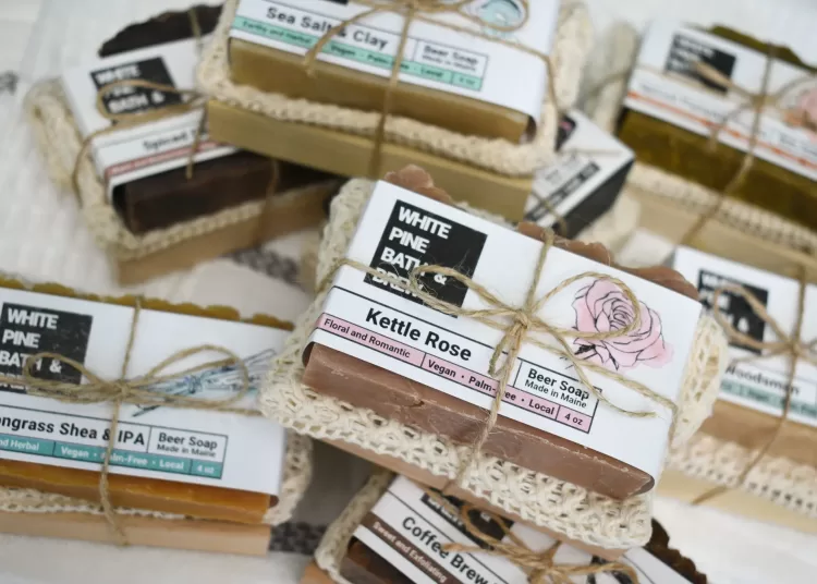
How did you get into making beer soap?
The first soap I ever made was beer soap. I’ve actually never made it without beer. I learned from a friend who did it as a hobby. When I wanted to jump into entrepreneurship, beer soap was what I chose.
When it comes to using beer destined for disposal, I am always surprised I didn’t do it sooner. Every business generates some level of production excess that is unavoidable. For breweries, this comes in the form of things like “past code” beer and “short pours.” Past code beer is essentially beer that was overstocked and is getting a bit old. While there is technically nothing wrong with the beer, its flavor is no longer as fresh and punchy. Short pours are individual cans of beer that did not get filled all the way on the canning line. While the breweries cannot sell this beer to drink, it is perfectly good for use in soap.
I started to ask myself “How common is this excess beer? Should I be using brewery waste exclusively?” This started a big mindset shift. I have some beer stocked up that I need to get through, but my goal is to eventually source all of my beer from brewery excess. I have received beer waste from 5 breweries so far and am excited to see where these collaborations take us.
How did you design your gift sets?
When I designed the sets, I was looking to diversify my product line while creating something that felt a bit more luxe and complete for gift-giving clients. I wanted to match my soaps to complimentary items that fit the skincare theme. I was lucky enough to find another small business owner, a woodworker, who now provides me with the stunning, minimalistic, solid soap dishes that I use today. The soap saver bags in my gift sets also come from a respectable brand. They are 100% certified organic cotton, fair trade soap bags. Even the string I use to tie it all together was chosen because of its natural hemp fiber.
How are you producing your labels?
I personally design and print all of my own labels. I’ve looked into custom labels in the past but have never found a look I liked. It is hard to find a good label that is plastic-free and still shows off the characteristic tops of my soaps. So far it has always made more sense financially to keep label production in-house.
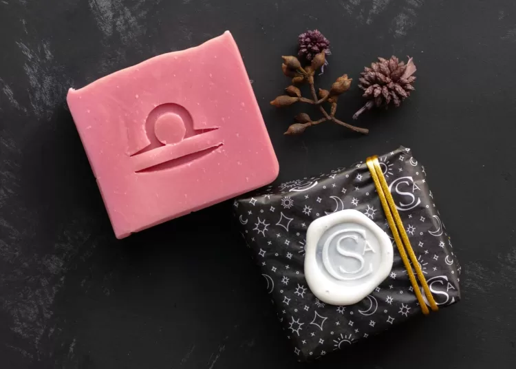
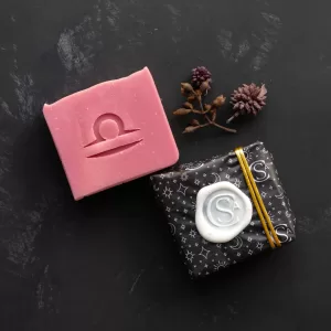
When I saw Soap Cult Australia’s color contrast between soaps, packaging, and seals- I needed to know how she did this! I asked Aliya Hutchison about her products, and she shared with me:
How did you create your labels and packaging?
My core range of soaps has matte labels, whereas the Zodiac Collection was glossed with the corresponding symbol and a little blurb about the star sign on the front of each label. My designer created a new tissue paper for me that had the Soap Cult symbol with some astrology-inspired patterns. Some were from our existing suite of illustrations and some were new for this project. Customers can purchase the soap with a standard label or have it gift-wrapped in our special Zodiac tissue paper with a vegan wax seal and gold cord for added luxury.
Where do you source black paper for your packaging?
The tissue paper comes from No Issue Tissue and they seem to be the best value and print Rich Black very well.
What advice do you have for new soap makers?
My advice to new soap makers who want to personalize their packaging is to go semi-custom. Use plain tissue paper to line your shipping boxes but use a branded sticker to seal it. Or create a larger thank you sticker or logo rubber stamp to go inside the lid so the customer sees it when they open it and go simple for the rest of the packaging. Often with just one branded element and sticking to your brand colours with everything else, you can make your business come across as luxury and professional without spending a fortune. When it comes to labels, if you’re not in a position to work with a designer just yet, try Etsy for a template for a semi-custom soap label. That way you can be consistent in your branding but can still do limited edition products, seasonal ranges etc.
Remember, customers expect a lot these days in terms of an unboxing experience but you can find a balance between super-expensive and boring. Semi-custom using your brand colors and just one or two branded elements. You got this!
Summary
We hope you enjoyed this tour of soap packaging from around the world. Hopefully it inspires you to see packaging as an asset for selling your soap! Tune in during the coming months as we release more soap ideas for your business!
Interested in a subscription to the magazine?
Interested in a digital or print subscription to our quarterly magazine? Or are you interested in reading back issues of the magazine?
Want more soap-focused articles?
We have several articles about soap artisans and soap making topics available on our site:
How Sara Gets Shoppers Excited About What She Sells
Finally, There’s a Company Producing “Clean Fragrances” for Candle and Soap Makers
This Idaho Soap Maker Keeps Reinventing Her Business
How Wholesale Skyrocketed Our Soap Business with Fixed, Monthly Orders
I Grew My Soap Business by Surveying My Customers
How Jae Got Her Products Into 200+ Stores, Spas, Hotels, and Boutiques
How Networking Was the Key to Growing This Seller’s Business


