We’re seeing many trends this year with artisans considering building their own websites. I’m writing a series this year for Handmade Seller to share an often overlooked area of website technology- accessibility. This is a topic that many people don’t fully understand. This series will help you understand what’s behind the topic of accessibility, what different platforms have to offer to meet accessibility guidelines, and how to help you make the decisions that make the most sense for your business. This month, we are digging into User Interface design and accessibility.

Creating a website that is both visually appealing and functional is essential for every small business. It’s another way for you to engage with your customers online when you’re not there! This combination of design and strategy is a bigger part of user interface (UI) design. And an often overlooked but critical aspect of UI design is accessibility.
Again, accessibility is the overarching term for online accommodations which assist users browsing the Internet. Integrating accessibility into UI design not only enhances the user experience for people with diverse needs but also fosters inclusivity and compliance with legal standards.
Key Principles of Accessible UI Design
Incorporating Color Contrast
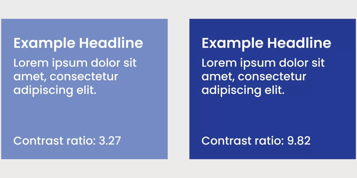
Layering analogous tones with subtle differences can be a stunning accent to enhance a design… But, there’s too little contrast to make it legible for everyone. And, on your website, that should be one of your top priorities.
Your site will have better readability by using contrasting colors. Of course you can still use your brand colors, but this is where you may need to play with color combinations to get the right contrast ratio. A quick (and free) go-to contrast checker is colourcontrast.cc. This browser-based tool lets you input hex codes to determine if the contrast ratio meets AA or AAA accessibility standards.
Using Buttons vs Anchor Links
We previously approached the decision of when to use buttons vs anchor links (aka text links) in The Importance of Semantic Code from an accessibility perspective.
From a UI perspective, the decision may come down to the visual hierarchy of what actions you want your audience to take on your website. Inline text links make it easy for a user to quickly look up a reference. Buttons, however, place a visual emphasis on the primary action you want them to take. These buttons have higher contrast and more negative space with the intention of hooking the user to guide them to the next step.
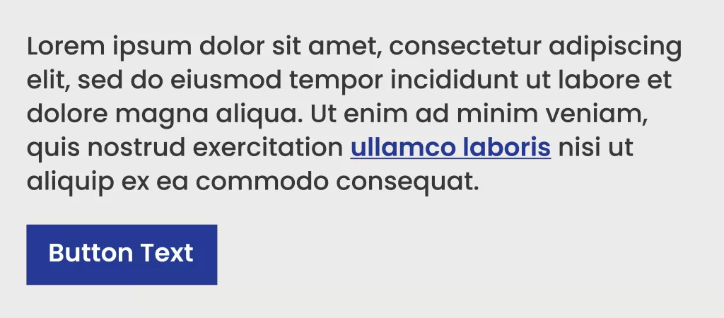
Read a more in-depth article by Smashing Magazine debating the use of buttons vs anchor links when it comes to UI if you’re interested in learning more!
What about ghost buttons?
Ghost buttons are buttons with a faint/thin outline. Similar to using low contrast in your design, they can look really cool and add to the aesthetic. But, also like low contrast design, ghost buttons can be confusing to users as they’re much more subtle and aren’t as obvious. We recommend using them sparingly, in addition to high-contrast buttons for primary calls to action.
Link Language
To paraphrase Sabrina Carpenter, “Please please please…” don’t use the words CLICK HERE in your links – buttons or otherwise. Aim to use action-oriented language to describe what the user is about to do. Plus. using more descriptive text for your buttons (and links) also provides additional information to screen readers that help users understand what each link will do.
Here are a few examples:
- Replace “submit” with “Send Request” or “Send Message” on your contact forms
- Replace “click here to download” with “Download the PDF” for digital downloads
- Replace “this article” with “read the article online” when linking out to reference websites
Headlines, Body Text and Typography

Order is Key with Headlines
Back to discussing the Importance of Semantic Code! Proper headline structure should be in ascending order (e.g. <h1>, <h2>, <h3>) to correctly organize the structure of your content for accessibility. This structure also makes website content more legible.
The best way to visualize the visual hierarchy of your headlines is to think of a newspaper: There’s always one, extra large headline at the top to grab your attention, then subsequent headlines as you continue reading the articles.
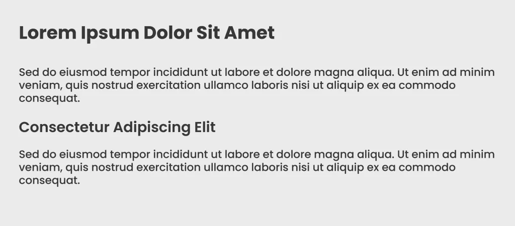
Body Text
Body text classifies the bulk of your website content including blog articles, case studies, product descriptions, biographies, etc. While there isn’t a specified font size for accessibility, we recommend aiming for a minimum size of 16px, although some fonts may need to be bumped up to 18px. Similarly, WCAG 2.1 AA guidelines state the minimum line height for paragraph text should be 1.5 times the font size. (Personally, we prefer 1.6 for a nice, clean spacing between lines of text!)
General Typography Guidelines
As a small business, of course you’d want to incorporate your brand typography into your website. It’s also critical to be mindful of how those fonts are going to be perceived in a digital environment. Calligraphic and handwritten fonts usually do not translate well, and are difficult to read even at a larger size. If you’re taking headlines and body copy into consideration, then you may want to consider using a larger, bolder font for headlines, and a cleaner, thinner—but not too thin—typeface for body copy.
Building Inclusive Websites with Accessible UI Design
Accessible UI design benefits everyone, especially your customers. It improves usability, boosts SEO (more to come soon), and helps ensure compliance with legal standards, all while fostering a positive brand image for your small business.
Want to read the whole series? Check out these articles:
Part 1:How to improve accessibility for your website
Part 2: Improving website accessibility- who creates the standards?
Part 3: Semantic code- what is it, and why is it important for accessibility?
Part 4:Website accessibility in Popular Platforms
Part 5: The issue with website accessibility overlays
Part 6: Equal Access, Diverse Content: Navigating Accessibility in Media
Interested in a subscription to the magazine?
Interested in a digital or print subscription to our quarterly magazine? Or are you interested in reading back issues of the magazine?
